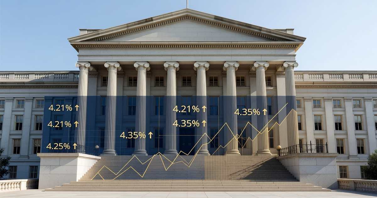
The U.S. Treasury yield curve sits in positive territory in June 2026, with the 10-year note yielding 4.41% and the 2-year note yielding 4.11% as of June 24, a gap of 30 basis points, according to the Treasury Department’s daily par yield data. That ordering, where longer-dated debt pays more than shorter-dated debt, is what a normal yield curve looks like. It is also a clean reversal of the condition that dominated bond-market headlines from 2022 through 2024, when the curve inverted and short-term yields climbed above long-term ones. The inversion that took hold in 2022 ran into September 2024, one of the longest stretches on record, and it carried a specific warning. Every U.S. recession since the 1960s has been preceded by an inverted curve. The curve has since normalized, yet the economy has so far avoided the downturn the signal implied. This article explains what a yield curve inversion is, why it earned its reputation as a recession indicator, where the curve stands today, and what its current shape means for the money you borrow and save. For live readings, the Treasury yield curve dashboard and the U.S. interest rates dashboard track these numbers every business day.
- A yield curve inverts when short-term Treasury yields rise above long-term yields, reversing the normal upward slope.
- The 2-year to 10-year spread first turned negative in 2022 and stayed negative until September 5, 2024 (FRED data).
- Every U.S. recession since the 1960s followed an inversion, which is why markets watch the signal closely.
- As of June 24, 2026, the curve is positive: 2-year 4.11%, 10-year 4.41%, a spread of 30 basis points.
- A normalized curve eases pressure on bank lending margins but does not by itself lower consumer borrowing costs.
What a Yield Curve Inversion Actually Is
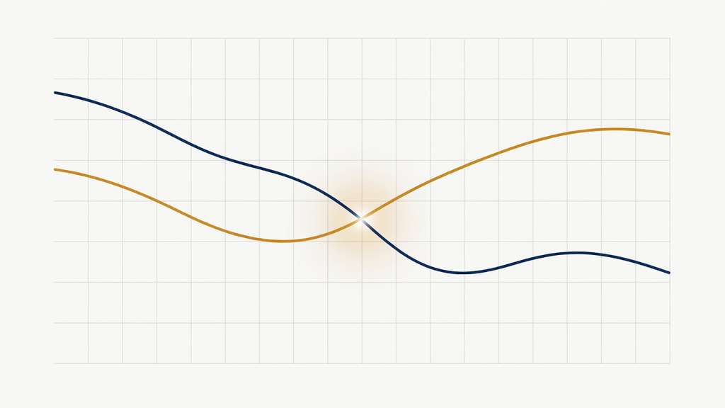
The yield curve is a snapshot of what the U.S. government pays to borrow across different lengths of time, from 4-week bills to 30-year bonds. Plotted on a chart, the yields normally rise from left to right because investors who lock up money for longer demand extra compensation for inflation risk and uncertainty. That upward slope is the default state of a healthy bond market. An inversion is the exception. It happens when shorter maturities yield more than longer ones, flipping part of the line downward and signaling that investors expect interest rates to fall in the future.
Analysts track two spreads most closely. The first is the 2-year to 10-year spread, often written as 2s10s, which compares medium and long maturities. The second is the 3-month to 10-year spread, which the Federal Reserve’s own research favors. When either gap drops below zero, the curve is inverted on that measure. The mechanics are straightforward. Short-term yields track the federal funds rate that the Fed sets directly, so they stay high when policy is restrictive. Long-term yields reflect the market’s view of growth and inflation years out, so they fall when investors expect the Fed to cut. When the market bets on future cuts while the Fed holds rates high, the curve inverts. The current prime rate sits on top of that same short-rate foundation.
Why an Inverted Curve Has Predicted Recessions
The inversion’s track record is the reason it commands attention. Going back to the 1960s, every U.S. recession has been preceded by a period when the yield curve inverted, typically several months to a year and a half before the downturn began. The Federal Reserve Bank of New York maintains a recession-probability model built specifically around the 3-month to 10-year spread, treating it as a leading indicator rather than a coincident one. The logic connecting the signal to the outcome runs through bank lending. Banks borrow short and lend long, so they fund themselves at short-term rates and earn long-term rates on loans. When the curve inverts, that spread compresses or turns negative, and lending becomes less profitable.
As lending tightens, credit becomes harder to get, businesses pull back on investment, and the slowdown can feed on itself. The inversion is therefore less a magic forecast than a reflection of two things happening at once: the Fed holding policy tight to fight inflation, and investors anticipating that the tightening will eventually break growth. The signal is not flawless. It has produced false alarms, and the lag between inversion and recession has varied widely. An inverted curve tells you the bond market is pricing in lower future rates, which usually means it expects economic weakness, not a date on the calendar.
Where the Curve Stands in June 2026
The curve that worried forecasters for two years has been normal again for a while. The 2s10s spread first turned negative in 2022, stayed below zero through the long restrictive stretch, and recorded its last negative reading on September 5, 2024, according to Federal Reserve Economic Data. It has held in positive territory since. As of June 24, 2026, the Treasury’s daily par yield curve shows the 3-month bill at 3.85%, the 2-year note at 4.11%, the 5-year at 4.17%, the 10-year at 4.41%, and the 30-year at 4.86%. The 2s10s spread stands at 30 basis points and the 3-month to 10-year spread at 56 basis points, both clearly positive.
What makes the current shape unusual is the backdrop. The Federal Reserve held the federal funds rate at 3.50% to 3.75% at its June 17 meeting and its updated projections leaned toward one rate increase later in 2026 rather than cuts, a hawkish turn under new Chair Kevin Warsh. A positive curve alongside a Fed signaling possible hikes is a different setup than the textbook case, where normalization usually arrives as the Fed eases. Here the long end has drifted up to reflect sticky inflation and heavy Treasury issuance, steepening the curve from the top rather than the bottom. The June FOMC decision reshaped those expectations in a single afternoon.
What the Yield Curve Means for Your Money
For households, the yield curve is less a crystal ball than a map of where rates sit across the system. The short end anchors the prime rate, which stays at 6.75% and drives credit card APRs and variable home equity lines. The long end, especially the 10-year note at 4.41%, sets the tone for fixed borrowing. Thirty-year mortgage rates move with the 10-year yield plus a spread, so a higher long end keeps home loans elevated even when the Fed is not cutting. You can track those moves on the current mortgage rates page.
A normalized curve also changes the calculus for savers. With short-term yields no longer towering over long-term ones, the payouts on cash and short Treasury bills that defined the inversion years remain competitive against money market funds, high-yield savings accounts, and short certificates of deposit. Because the curve is only gently upward sloping, the extra yield for locking a longer-term CD is thin. Savers comparing options can review the best CD rates and best high-yield savings accounts to weigh short against long. The broader point is that a positive curve removes one recession warning, but with the Fed signaling a possible hike, borrowing costs are not poised to fall soon. The Fed rate forecast for 2026 lays out the paths from here.
Do not read a single day’s spread as a turning point. The 2s10s gap wiggles by a few basis points daily, so what matters is a sustained move across or away from zero, not one print. Watch both the 2s10s and the 3-month to 10-year spreads together, since they can diverge, and pair them with the Fed’s policy path. If the curve flattens sharply while the Fed holds rates high, that is the combination worth taking seriously.
Frequently Asked Questions
What is a yield curve inversion?
A yield curve inversion occurs when shorter-term Treasury securities yield more than longer-term ones, reversing the normal upward slope. In a healthy market, a 10-year note pays more than a 2-year note because investors want extra compensation for tying up money longer. When that relationship flips and the 2-year out-yields the 10-year, the curve is inverted. It signals that the market expects interest rates, and often economic growth, to fall in the future. Analysts most often measure inversion using the 2-year to 10-year spread or the 3-month to 10-year spread, both published daily by the Treasury and the Federal Reserve.
Does an inverted yield curve always mean a recession is coming?
The historical record is strong but not perfect. Every U.S. recession since the 1960s has been preceded by a yield curve inversion, which is why economists treat it as a reliable leading indicator. The reverse is less certain. Inversions have occasionally been followed by long delays or unusually mild slowdowns, and the lag between the signal and any downturn has ranged from a few months to well over a year. The inversion reflects market expectations rather than a guaranteed outcome, so it is best read as a warning that risks are rising, not as a fixed prediction with a date attached.
Why did the 2022 to 2024 inversion not produce a recession right away?
The 2022 to 2024 inversion was one of the longest on record, yet the economy kept expanding through it. Several factors stretched the usual lag. The labor market stayed resilient, consumer spending held up, and the Federal Reserve engineered a slowing of inflation without a sharp jump in unemployment. The inversion accurately reflected a market that expected the Fed to eventually cut rates, and it did signal genuine stress in bank lending margins. But the broad economy proved more durable than the signal’s history implied.
Is the yield curve inverted right now in 2026?
No. As of June 24, 2026, the U.S. Treasury yield curve is positively sloped. The 2-year note yields 4.11% and the 10-year note yields 4.41%, a positive spread of 30 basis points, while the 3-month to 10-year spread sits at 56 basis points. The curve last showed an inverted 2-year to 10-year reading on September 5, 2024, and has held positive since. What is notable is that this normalization has come alongside a Federal Reserve that held rates in June and signaled a possible hike later in 2026, rather than the rate cuts that usually accompany a steepening curve.
How does the yield curve affect mortgage and loan rates?
Different parts of the curve drive different products. The short end is tied to the federal funds rate and the prime rate, currently 6.75%, which sets variable costs like credit card APRs and home equity lines of credit. The long end, led by the 10-year Treasury yield, guides fixed-rate products. Thirty-year mortgage rates generally track the 10-year yield plus a spread, so when the long end rises, home loans tend to follow even if the Fed is on hold. A positive but gently sloped curve, like the present one, means short and long borrowing costs are closer together than during the deep inversion years.
What should I watch on the yield curve from here?
Track the 2-year to 10-year and 3-month to 10-year spreads together, since they can send different messages, and read them against the Fed’s policy path. A sustained flattening back toward zero while the Fed keeps rates high would revive recession concerns. A steepening driven by a rising long end, as seen lately, points more to inflation and heavy Treasury supply than to imminent easing. The Federal Reserve Bank of New York’s recession-probability model and the Treasury’s daily par yield data are the primary sources. For a continuously updated view, the PrimeRates Treasury yield curve dashboard plots the full curve each business day.
Watching the Curve Through 2026
The yield curve has moved from a closely watched recession warning to a quiet positive slope, even as the Federal Reserve has turned more hawkish. Whether the curve steepens further on long-end pressure or flattens again on growth fears will shape the rate environment for the rest of the year. For ongoing tracking, the Treasury yield curve dashboard, the U.S. interest rates dashboard, and the guide to how the Fed affects loans are updated continuously.
References
- Federal Reserve Economic Data (FRED), St. Louis Fed. “10-Year Treasury Constant Maturity Minus 2-Year Treasury Constant Maturity (T10Y2Y).” fred.stlouisfed.org
- Federal Reserve Economic Data (FRED), St. Louis Fed. “10-Year Treasury Constant Maturity Minus 3-Month Treasury Constant Maturity (T10Y3M).” fred.stlouisfed.org
- U.S. Department of the Treasury. “Daily Treasury Par Yield Curve Rates.” home.treasury.gov
- Board of Governors of the Federal Reserve System. “H.15 Selected Interest Rates.” federalreserve.gov
- Federal Reserve Bank of New York. “The Yield Curve as a Leading Indicator.” newyorkfed.org
- Board of Governors of the Federal Reserve System. “FOMC Calendars and Information.” federalreserve.gov