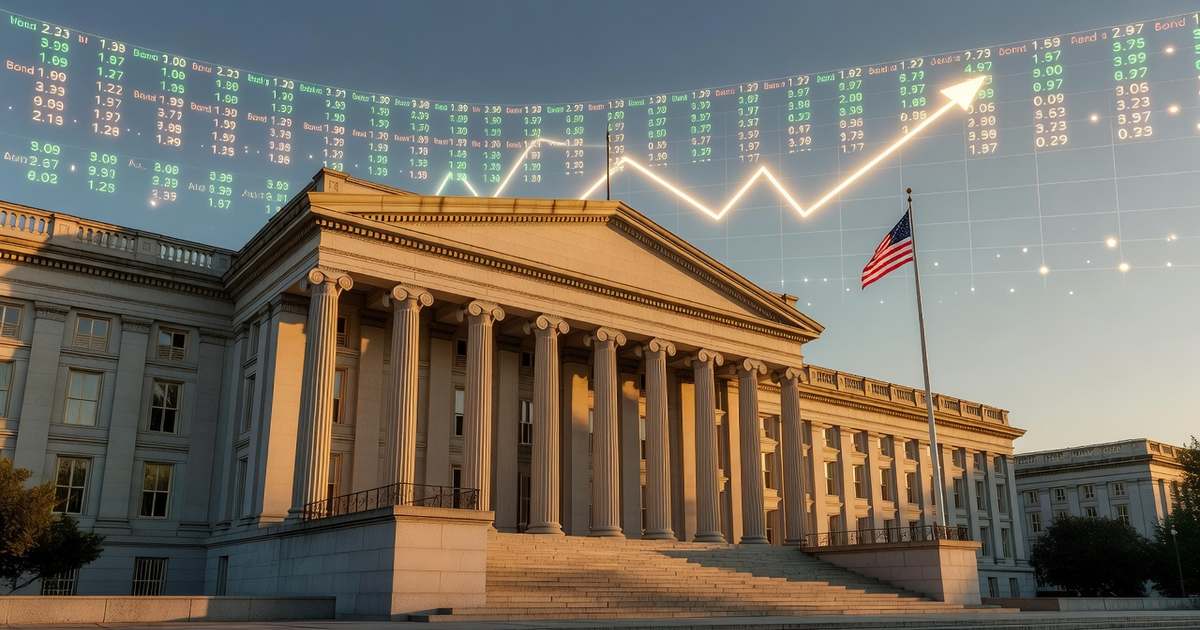
A yield curve inversion happens when short-term U.S. Treasury bonds pay higher interest than long-term Treasury bonds — the opposite of normal. The most-watched version is the spread between the 10-year Treasury yield and the 2-year Treasury yield. When that spread turns negative (2-year yield higher than 10-year yield), the curve is inverted. Inversions matter because they have preceded every U.S. recession since 1969 — eight recessions, eight advance warnings, with lead times ranging from 6 to 23 months. The 2022 to 2024 inversion lasted 27 months, the longest on record, and un-inverted in December 2024. As of April 10, 2026, the 10-year yield sits at 4.31% and the 2-year at 3.81% — a +50 basis point spread, firmly positive again after that historic un-inversion. For borrowers, the shape of this curve quietly drives 30-year mortgage pricing, auto loan APRs, and even what your high-yield savings account pays.
- Eight for eight since 1969 — every U.S. recession has been preceded by a 2-year/10-year yield curve inversion, with only one notable false positive (1966).
- Average lead time from first inversion to recession start is roughly 15 months, though the range is wide: 6 to 23 months historically.
- Current spread (April 10, 2026): +50 basis points. The 10-year yield is 4.31% and the 2-year is 3.81%, firmly positive after a 27-month inversion that ended in December 2024.
- The un-inversion is often the real warning. Four of the last six post-1977 recessions began after the curve re-steepened, not during the inversion itself.
- Curve shape is not only a recession signal — it drives mortgage rates, auto APRs, HYSA yields, and CD pricing in real time, whether or not a downturn follows.
- What a Yield Curve Actually Is
- Normal, Flat, Inverted: The Three Shapes
- Why the 2-Year vs 10-Year Spread Is the One Everyone Watches
- Inversions and Recessions: The 60-Year Track Record
- The 2022 to 2024 Inversion — Why It Lasted 27 Months
- How the Curve Shape Moves Your Borrowing Costs
- How to Read the Curve Yourself (Free .gov Tools)
- Frequently Asked Questions
What a Yield Curve Actually Is
A yield curve is a line chart plotting the interest rate (yield) paid by U.S. Treasury securities across every maturity the government issues — from 1-month Treasury bills all the way out to 30-year Treasury bonds. The horizontal axis shows how long your money is tied up; the vertical axis shows the yield you earn. In a normal economy, the line slopes gently upward from left to right: you get paid more to lend the government money for 10 years than for 3 months, because you are taking on more time risk.
That upward slope is the bond market’s way of pricing time. Longer-term bonds carry more uncertainty about inflation, policy shifts, and the health of the U.S. Treasury itself, so investors demand extra compensation — what economists call a term premium — to hold them. When the curve looks normal, financial institutions borrow short, lend long, and earn the spread. This is the economic engine that funds mortgages, auto loans, business credit, and a large share of bank profitability. For a live view of current Treasury yields and how they stack up today, see our Treasury yield curve dashboard.
Normal, Flat, Inverted: The Three Shapes
Every yield curve falls into one of three shapes, and each tells you something specific about what the bond market believes will happen next.
Normal (upward-sloping). Short-term yields below long-term yields. The bond market is pricing in a steady or growing economy and stable inflation expectations. This is how the curve looked for most of 2010 to 2019 and again starting in mid-2025. The steeper the slope, the more optimistic the market is about growth.
Flat. Short-term and long-term yields sit at roughly the same level. A flat curve often signals the end of a tightening cycle — the Fed has raised short rates to where they roughly match long rates, and the market is unsure whether the economy will cool gently or stall. Flat curves are usually transitions, not destinations.
Inverted (downward-sloping). Short-term yields above long-term yields. The bond market is signaling that it expects short-term rates to fall meaningfully in the future — typically because it expects the Federal Reserve to cut in response to slowing growth. Investors pile into long-dated Treasuries to lock in today’s higher long-term yields before they drop, pushing those yields down. That’s the mechanism. The reason the market worries about future cuts in the first place is usually the same reason it expects a recession.
Why the 2-Year vs 10-Year Spread Is the One Everyone Watches
Treasury yields are quoted at roughly a dozen standard maturities, so the curve can be measured many different ways. The two most commonly tracked inversion spreads are the 10-year minus the 2-year (the 2s10s) and the 10-year minus the 3-month T-bill. Both have a strong historical track record. The Federal Reserve’s own research — particularly from the New York Fed and Cleveland Fed — often emphasizes the 10-year/3-month spread for formal recession probability modeling. The 2s10s is what Wall Street watches intraday because the 2-year Treasury is the most liquid short-dated benchmark actively traded alongside the 10-year.
The 2-year yield is heavily shaped by market expectations of Fed policy over the next 24 months. When markets expect the Fed to cut, the 2-year falls. When they expect the Fed to hike, it rises. The 10-year is shaped more by long-run inflation expectations and growth. When the 2-year rises above the 10-year, the market is effectively saying: we think rates are too high for where the economy is headed, and the Fed will have to cut. That expectation is almost always rooted in a bet that the economy is slowing faster than the Fed currently sees. The forecasting signal that shapes those expectations is the Fed’s quarterly rate projection — for how to read that chart, see our guide on how to read the Fed dot plot.
Inversions and Recessions: The 60-Year Track Record
The predictive record of the yield curve is one of the most-studied phenomena in macro finance. Every U.S. recession since 1969 — eight of them — has been preceded by an inversion of the 2s10s spread. The only clear false positive was a brief inversion in 1966 that was followed by a sharp slowdown and credit crunch but not an NBER-dated recession. Economist Campbell Harvey, whose 1986 dissertation first formalized the inverted-curve-as-recession-signal thesis, has tracked the indicator publicly for nearly four decades and still calls it the cleanest macro predictor on record.
Lead times vary considerably. After the first day of inversion, the shortest lag to a recession was roughly 6 months (ahead of the 1990 recession); the longest pre-2022 was 23 months (ahead of the Great Recession). The average lead time is roughly 15 months from first inversion and about 4 to 5 months from the last positive print before a recession. That wide range is why the curve is best used as a directional signal, not a stopwatch.
One critical wrinkle: the New York Fed’s probit recession models use the 10-year/3-month spread rather than the 2s10s, and the Chicago Fed has noted that the predictive power of the curve may be tied to the specific inflation-risk and real-rate components baked into the spread rather than the spread itself. In plain English — the curve does not cause recessions. It reflects expectations that are themselves accurate predictors. When investors collectively bet on future rate cuts, they are usually right about the underlying slowdown.
The 2022 to 2024 Inversion — Why It Lasted 27 Months
The 2s10s spread first turned negative on October 25, 2022, and did not un-invert until December 12, 2024 — a stretch of 27 months that broke the previous record of 23 months set ahead of the 2008 financial crisis. During that entire period, headline commentary cycled through “the recession is imminent,” “the recession is delayed,” and eventually “maybe the yield curve has finally broken as a signal.” The recession did not arrive on the expected schedule.

Several factors stretched the lead time. First, the post-pandemic economy retained unusually strong balance sheets at the household and corporate level, thanks to fiscal transfers and a wave of corporate refinancing locked in at 2020 to 2021 lows. Second, the Fed’s own balance sheet — still large by historical standards even during quantitative tightening — kept a floor under long-term Treasury yields. Third, foreign demand for U.S. Treasuries from global central banks held long yields lower than domestic fundamentals alone would have suggested. The signal was still there. The transmission mechanism just took longer to work through an economy that had been unusually insulated. For a live view of the Fed’s balance sheet and how it shapes long yields, see our Fed balance sheet tracker.
The un-inversion is usually the real signal — not the inversion itself. Of the six recessions since 1977, four began after the 2s10s curve re-steepened out of inversion, typically once the Fed began cutting. The December 2024 un-inversion puts the current cycle squarely in the historical window where slowdowns have historically emerged. Watch not whether the curve is inverted, but whether a freshly un-inverted curve is steepening because long rates are rising (healthy re-pricing) or because short rates are falling (Fed cutting into a slowing economy). Those two types of steepening have very different implications for your borrowing and savings decisions.
How the Curve Shape Moves Your Borrowing Costs
The shape of the yield curve directly determines the rates you see on almost every consumer loan, savings product, and investment, whether or not a recession materializes. The simple rule: short-term benchmarks drive short-term products; long-term benchmarks drive long-term products.
30-year mortgage rates track the 10-year Treasury yield plus a spread of roughly 150 to 250 basis points that covers mortgage-backed-security risk and originator margins. When the 10-year yield rises — as it has in April 2026, hitting 4.39% mid-month — mortgage rates rise with it. When it falls, they fall. The 2-year barely matters here. For current benchmark pricing, see our current mortgage rates page, and for a live readout of all the benchmarks at once, the U.S. interest rates dashboard.
Auto loan APRs follow the 3 to 5 year part of the curve for new car financing. Used car loans and auto refinance typically key off slightly shorter maturities. When the 5-year Treasury yield moves 25 basis points, auto lenders generally reprice their advertised rates within two to four weeks.
High-yield savings account rates and money market yields track very short-term benchmarks — the federal funds rate, overnight reverse repo, and the 1-month T-bill. A steepening curve driven by falling short rates (Fed cuts) is the main reason HYSA yields drop. For a view of where savings rates sit today and where they are projected to go, see best high-yield savings accounts.
CD rates span the curve by design — a 6-month CD follows short rates, a 5-year CD follows intermediate rates, and long-term institutional CDs follow the long end. This is why savers with CD ladders win during rate-cut cycles: the longer rungs were locked in before the cut.
Credit card APRs and variable personal loans are priced off the prime rate, which moves with the federal funds rate. These products are mostly insulated from the long end of the curve. For the precise mechanics of how each consumer product reprices, see how Fed rate decisions affect your loans and the current U.S. prime rate.
When the curve un-inverts, CD ladders beat waiting on HYSA. Here’s why: if the un-inversion comes from the Fed cutting short rates (the historically bad-news version), HYSA yields drop fastest because they reset weekly or monthly. CDs locked in before the cut keep paying the higher rate until maturity. Even a 12-month CD opened the week before the first Fed cut can out-earn a HYSA by 40 to 60 basis points over the following year. Our CD ladder strategy guide walks through how to build one; the broader best CD rates page shows what’s available right now.
How to Read the Curve Yourself (Free .gov Tools)
You do not need a Bloomberg terminal or a brokerage account to track the yield curve daily. Every relevant data series is free and published by the federal government, updated once per business day.
The U.S. Treasury Daily Par Yield Curve Rates table is the primary source — posted on treasury.gov each business day at approximately 4:00 PM ET, showing the closing yield at every standard maturity from 1 month to 30 years. One scan tells you whether the curve is normal, flat, or inverted, at any point along its length.
The St. Louis Fed’s FRED database maintains the T10Y2Y series (10-year minus 2-year spread) and T10Y3M (10-year minus 3-month spread) as free, downloadable historical charts going back to the 1970s. Hovering over any date on the FRED chart gives you the exact spread for that day, which is useful for checking how the current level compares to past pre-recession prints.
The Federal Reserve Bank of New York’s recession probability model translates the 10-year/3-month spread into a forward 12-month recession probability and posts it monthly. This gives you not just the spread but also the model-implied odds of recession. It is a free download from the NY Fed’s website. For a one-page live snapshot built around this approach, our Treasury yield curve dashboard pulls the same underlying data.
Frequently Asked Questions
What is a yield curve inversion?
A yield curve inversion occurs when short-term U.S. Treasury securities pay higher interest than long-term Treasury securities — the opposite of normal. Most commonly measured as the 10-year Treasury yield minus the 2-year Treasury yield (the 2s10s spread). When that spread goes negative, the curve is inverted. Inversions historically signal that the bond market expects future rate cuts, usually because it expects an economic slowdown.
Why does the 2-year / 10-year spread matter?
Because it has preceded every U.S. recession since 1969 — eight recessions, eight advance warnings, with only one false positive in 1966. The 2-year Treasury reflects near-term Fed policy expectations while the 10-year reflects long-run growth and inflation expectations. When the shorter-term yield rises above the longer-term yield, the bond market is collectively pricing in rate cuts, which historically only come when the economy is slowing or contracting.
Is the yield curve inverted right now?
No. As of April 10, 2026, the 10-year Treasury yield is 4.31% and the 2-year is 3.81%, producing a +50 basis point spread. The curve is firmly positive and has been since December 12, 2024, when it un-inverted after a record-setting 27 months of inversion that began on October 25, 2022. For live daily readings, check the U.S. Treasury daily par yield curve tables or our Treasury yield curve dashboard.
How accurate is the yield curve as a recession signal?
Extremely accurate directionally, variable on timing. The 2s10s spread has correctly signaled every U.S. recession since 1969 with one false positive (1966). However, the lead time from first inversion to recession start has ranged from 6 months to 23 months (2008) and stretched to unprecedented territory in the 2022 to 2024 episode, which lasted 27 months without a recession following. The signal is reliable; the timing is not.
What’s the difference between inversion and un-inversion?
Inversion is when short rates rise above long rates; un-inversion (or re-steepening) is when the curve returns to its normal upward slope. Historically, the un-inversion is often more predictive of near-term recession than the inversion itself. Four of the six recessions since 1977 began after the curve steepened back out of inversion, typically when the Fed started cutting short rates in response to slowing data. Watch the un-inversion mechanism: rising long rates are healthy, falling short rates plus a slowing economy are not.
How does the yield curve affect mortgage rates?
Directly. 30-year fixed mortgage rates track the 10-year Treasury yield plus a spread of roughly 150 to 250 basis points. When the 10-year rises, mortgage rates rise within days. When it falls, mortgage rates fall. The 2-year yield and the federal funds rate have almost no direct effect on 30-year mortgages. This is why the Fed can cut short-term rates without immediately lowering mortgage rates — mortgages are pegged to the long end, not the short end.
When was the longest yield curve inversion in history?
The 2022 to 2024 inversion was the longest on record at 27 months, from October 25, 2022 to December 12, 2024. It broke the previous record of 23 months set ahead of the 2008 financial crisis. The stretched duration was driven by unusually strong post-pandemic household and corporate balance sheets, ongoing Fed balance sheet accommodation even during quantitative tightening, and sustained foreign demand for long-dated U.S. Treasuries.
Next Steps: Turning the Curve Into a Decision
The yield curve is not a crystal ball — it is a thermometer. It does not tell you precisely when a downturn will hit or which sectors will feel it first. What it does is summarize, in a single spread, how the bond market collectively weighs short-term policy expectations against long-term growth. Right now, that spread is positive after a historic inversion and un-inversion — which historically places us in the window when slowdowns have tended to emerge. None of that is a forecast. It is, however, a reason to check your variable-rate debt, your emergency fund, and your CD ladder strategy sooner rather than later.
To put specific numbers to your own situation, use the prime rate impact calculator for your variable-rate debt, check the Fed rate forecast for 2026 to see how policymakers expect rates to move, and read how the prime rate affects your monthly payment for worked scenarios at different debt levels.
References
- Federal Reserve Bank of St. Louis (FRED). “10-Year Treasury Constant Maturity Minus 2-Year Treasury Constant Maturity (T10Y2Y).” fred.stlouisfed.org
- U.S. Department of the Treasury. “Daily Treasury Par Yield Curve Rates.” home.treasury.gov
- Federal Reserve Bank of New York. “The Yield Curve as a Leading Indicator.” newyorkfed.org
- Federal Reserve Bank of Cleveland. “Yield Curve and Predicted GDP Growth.” clevelandfed.org
- Federal Reserve Bank of Chicago. “Why Does the Yield-Curve Slope Predict Recessions?” Chicago Fed Letter No. 404. chicagofed.org
- Federal Reserve Bank of St. Louis. “Recession Signals: The Yield Curve vs. Unemployment Rate Troughs.” stlouisfed.org